CASE STUDY:
excelsior brewing company
Almost 12 years ago, I read an article in the local weekly newspaper about some local entrepreneurial beer fans that were in the early stages of building a new craft brewery. It was to be located in Excelsior, on the shores of Lake Minnetonka.
After a bit of online investigation, I tracked down John Klick, one of the partners mentioned in the paper, and I got in touch. The conversation went something along the lines of “Hi, you don’t know me, but I wondered if I could do your logo.” The response was both generous and fruitful—and over the following weeks John and I collaborated on ideas and discussed many options. Multiple design iterations were created, colors considered, and shapes explored.
Eventually landing on the silhouette of a boat transom (actually John’s 1976 Skiff Craft), the logo was designed to be strong and simple, with a hint of ‘lake life’ and a dash of ‘industrial badge’—appropriate for a brewery housed in a converted garage. The ‘barley wake’ element helps to connect the brewery to the lake —and also raises the question about the boat: is it going away or coming towards you?
Today the blue logo can be seen far and wide on t-shirts, hats, bike jerseys, and of course, the beer packaging.
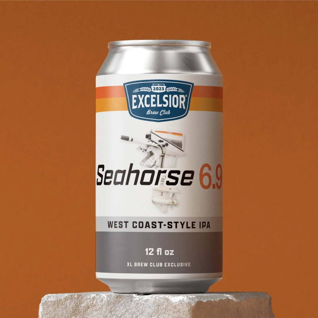
Recent work by DKD for the Excelsior Brewing Company includes packaging for cans, bottle labels, 12 boxes and 6-packs, and a variety of promotional material for taproom events and retail point-of-sale.


